Colour Palette
#312E37
49, 46, 55

primary text and footer colour
#F56F54
245, 111, 84

main accent colour used for cta button text or cta primary button background
#FAFFFD
250, 255, 253

used for cta button backgrounds
#C6D1D3
198, 209, 211

light grey subheading accent colour
#EFEFEF
239, 239, 239

page background colour
Typography
HEADINGS
Heading 1
Sample code:
              <h1>INTRO TITLE H1 EXAMPLE</h1>
              <p class="big-title">INTRO TITLE h1 EXAMPLE</h1>
              h1 {
                font-family: moonFont;
                font-weight: 300;
                color: #3E3E3E;
                font-size: 3rem;
                letter-spacing: .075em;
              }
Heading 2
Sample code:
              <h2>PRODUCT NAME H2</h2>
              h2 {
                font-family: moonFont;
                font-weight: 300;
                color: #3E3E3E;

                letter-spacing: 3px;
              }
Heading 3
Sample code:
              <h3>BESTSELLERS SECTION TITLES</h3>
              h3 {
                font-family: moonFont;
                font-weight: 300;
                color: #3E3E3E;
                letter-spacing: 3px;
              }
PARAGRAPH TAGS
Lorem ipsum dolor sit amet, consectetur adipisicing elit, sed do eiusmod tempor incididunt ut labore et dolore magna aliqua.
Sample code:
              <p>Product Description body text</p>
              p {
                font-weight: 400;
                font-family: "Mulish", "Roboto", sans-serif;
                color: #3E3E3E;
                line-height: 140%;
              }
BULLETED LISTS
Product specs:
- Lorem ipsum item 1
- Lorem ipsum item 2
- Lorem ipsum item 3
Sample code:
            <p>Product specs</p>
            <ul>
              <li><p>Item info 1</p></li>
              <li><p>Item info 2</p></li>
              <li><p>Item info spec 3</p></li>
            <ul>
NUMBERED LISTS
Product detail breakdown
- Lorem ipsum item 1
- Lorem ipsum item 2
- Lorem ipsum item 3
Sample code:
            <p>Product breakdown info</p>
            <ol>
              <li><p>Item list 1</p></li>
              <li><p>Item list 2</p></li>
              <li><p>Item list 3</p></li>
            <ol>
TEXT WITH LIGHTER COLOR
less important text
Sample code:
            <p class="light-color-text">less important text</p>

            .light-color-text{
              color: #C6D1D3;
            }
Grid System
Our grid system consists of 12 columns with a 20px gutter. Many of our layouts skip the first and last column, spanning the 10 inner columns of the grid. An example of the 12 column grid is below, along with our other grid layout sizes.
Check out the example
Naming Conventions
These are our naming conventions thus far that we will abide by for consistency across each team member when naming classes, ids, etc.
- class names: hyphenated and lowercase
- id: lowercase (and hyphenated when applicable)
File Structure
Below is an example of what our file structure will look like.

Input fields
Name: Search and Email input.
Description: User input fields for search fields and email entry.
Responsive example (of the actual code being executed):
Label
Code sample:
            <p class="input-label">Label</p>
            <input type="text" name="search" placeholder="search" class="searchbar">
            .searchbar {
              margin-right: 2em;
              padding: 0.5em 0 0.5em 2em;

              color: #C6D1D3;

              border: 0px;
              box-shadow: inset 5px 5px 10px #CBCBCB, inset -5px -5px 10px #FFFFFF;
              border-radius: 18px;
            }
            .input-label {
              padding-left: 26.7px;
              margin-bottom: 3px;
            }
Author: Jason
checkbox
Used on the checkout pages
Code sample:
            <input type="checkbox" name="same-adress" id="same-adress" class="checkbox">
            <label for="same-adress"> My billing address is the same as my shipping address</label>
Maintain: Jason
Inline Links
Name: In text links.
Description: Links in text for inline navigation to other pages.
Responsive example:
View our bestsellers below or try building your own !
Code sample:
            <a class="inlinelink" href="#pageorsection">building your own</a>
            a.inlinelink {
              color: #F56F54;
            }
Author: Team
Product card
Name: Product/item card module.
Description: Product card module for product list pages.
Responsive example:
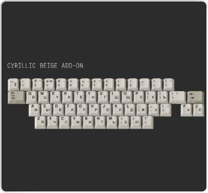
CLEAR KEYCAPS
In Stock
$35
Code sample:
            <a class="sampleproductcard">
              <img src="img/products/ IMAGE PATH" alt="keycap image">
              <div class="product-info">
                <div class="">
                  <p>CLEAR KEYCAPS</p>
                  <p class="light-color-text">In Stock</p>
                </div>
                <div class="">
                  <p class="orange-pricetag">$35</p>
                </div>
              </div>
            </a>

            a.sampleproductcard {
              border: none;
              border-radius: 25px;
              background-color: #EFEFEF;
              width: 300px;
              display: flex;
              flex-direction: column;
              padding: 1em;
              box-shadow: 3px 3px 6px rgba(203, 203, 203, .65), -3px -3px 6px rgba(255, 255, 255, .65);
              margin: 2rem 0 2rem 0;
            }
            a.sampleproductcard:hover{
              box-shadow: 10px 10px 20px #CBCBCB, -10px -10px 20px #FFFFFF;
              cursor: pointer;
            }
            .sampleproductcard img{
              width: 100%;
              height: 225px;
              display: flex;
              flex-direction: row;
              justify-content: center;
            }

            .product-info{
              display: flex;
              flex-direction: row;
              justify-content: space-between;
            }
            .product-info p{
              max-width: none;
              padding: 0;
              margin: 0.25em;
            }

            .product-info div:first-child {
              width: 85%;
            }
            .orange-pricetag {
              color: #F56F54;
            }
Author: Jason
Maintain: Jason
Shopping Cart
Name: Shopping cart checkout module
Description: Checkout module overlay that appears when user adds item to cart and continues to checkout with secondary orange CTA button for proceeding to checkout.
Responsive example:
Your Cart
Subtotal
$35.00
Code sample:
          <div class="shopping-cart">
            <div class="flex-row space-between">
                <h3>Your Cart</h3>
                <a class="flat-button">
                <img src="img/icons/x.svg" alt="">
                </a>
            </div>
            <img src="img/icons/orangeline.svg" alt="">
            <div class="cart-product-wrapper">
                <div class="product">
                    <img src="img/cartkeycapthumbnail.png" alt="" class="product-thumbnail">
                    <div class="description">
                        <div>
                            <div class="flex-row space-between">
                            <h4>Clear Resin Keycap Set</h4>
                            <a class="flat-button" href="">
                                <img src="img/icons/x.svg" alt="">
                            </a>
                            </div>
                            <p>Microchip style clear resin artisan keycaps.</p>
                        </div>
                        <h4 class="orange-pricetag">$35</h4>
                        <h4>
                            <a class="flat-button small">-</a>
                            1
                            <a class="flat-button small">+</a>
                        </h4>
                    </div>
                </div>
                ... repeat div.product as needed...
            </div>
            <img src="img/icons/greyline.svg" alt="">
            <div class="subtotal">
                <h4>Subtotal</h4>
                <h4>$35.00</h4>
            </div>
            <div class="flex-row justify-content-center">
                <a href="#checkout" class="secondary-button">proceed to checkout</a>
            </div>
          </div>

          .shopping-cart {
            width: clamp(20em,100%,32em);
            border: 1px solid;
            border-color: #8E8E8E;
            border-radius: 35px;
            padding: 2em;
          }

          .shopping-cart h4{
            font-family: "Mulish", sans-serif;
            font-weight: 600;
            color: #312E37;
            letter-spacing: 0.75px;
          }
          .shopping-cart .orange-pricetag{
            color: #F56F54;
          }

          .shopping-cart img {
            width: 100%;
            height: auto;
          }
          .shopping-cart .product-thumbnail {
            width: clamp(100px, 40%, 125px);
            height: auto;
          }
          .shopping-cart .cart-product-wrapper {
            padding: 2em 0 2em 0;
            min-height: 20em;
            height: 100%;
            flex-grow: 5;
          }
          .shopping-cart .product {
            display: flex;
            flex-direction: row;
            margin-bottom: 20px;
          }
          .shopping-cart .subtotal {
            display: flex;
            flex-direction: row;
            justify-content: space-between;
          }
          .shopping-cart .checkout-button {
            display: flex;
            flex-direction: row;
            justify-content: center;
            margin: 2em 0 1em 0;
          }
          .shopping-cart .checkout-button a{
            border: none;
            border-radius: 25px;
            background-color: #F56F54;
            color: white;
            padding: 1em 2em 1em 2em;

            box-shadow: 5px 5px 15px #BEBEBE, -5px -5px 15px #FFFFFF;
          }

          .product .description{
            display: flex;
            flex-direction: column;
            justify-content: space-between;
            padding-left: 0.5em;
          }
          .product .description p {
            color: #8E8E8E;
            font-size: 0.8em;
            max-width: 100%;
            margin: 0;
            padding: 0.25em 0 0 0;
          }
          .product .description h4 {
            margin: 0;
          }
Author: Team